Hello folks!
The Wimbledon is starting next Monday, and because of that I’ve prepared the special update for the app. As you probably noticed, recently I added the possibility to play bo5 matches, and this feature is released for all the app users, not only for subscribers. I respect people who can play that long matches – I’ve never tried but I can imagine it could be out of my range 🙂
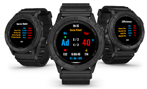
Back to the topic – recently I worked on the application design and I wanted to make it more vivid and easier to understand for new users. I changed the coloring of the app, resized fonts, and added icons. I hope that now the app will be more readable for the users, you can see at a glance what is going on, where are calories burnt, or heart-rate indicators. The green ball shows you who serves now and the color of the serve indicator is matching the server – blue is for you, and red is for your’s opponent. I hope you’ll like the new colors and design, do not be afraid to send me a short note about what you think about that! 🙂